Silveroute - Quote Shipping Web Platform

Streamlining Cross-Border Freight Through Thoughtful UX

Silveroute is a cross-border freight forwarder specializing in land-based shipments between Mexico and the United States. With clients managing high shipment volumes and volatile rate conditions, Silveroute needed a reliable and scalable digital platform to centralize their quoting, booking, and shipment tracking operations.
How was I involved?
Product Designer (UX & UI) I led the end-to-end design process

This was my first full-cycle UI/UX design project — from research and logic planning to responsive, production-ready UI.

I was responsible for:
  • UX Strategy & Architecture – Defined the overall application logic, designed end-to-end quote and shipment flows, mapped field behaviors, and prioritized features based on user needs and API capabilities.
  • UI Design – Created responsive, production-ready interfaces for every stage of the user journey
  • Developer Collaboration – Structured components based on API constraints, optimized inputs for clean data transfer
I worked closely with developers and stakeholders to shape the platform’s logic, usability, and implementation roadmap.
______

Client: Silveroute
Developer: Simon Balthazar / https://balthazaurus.com/

Overview

Background
Before this project, Silveroute managed all quoting and shipping coordination manually through emails and internal communication. Customers would have to request quotes directly from a representative, and every shipment setup involved back-and-forth confirmation, which slowed down operations and added friction for repeat clients. As a company looking to grow, Silveroute wanted to streamline the entire quoting and shipping process by providing customers with a self-serve platform.

I was tasked with designing the core UX and UI for a centralized quoting and shipment management tool, aligning user needs, API constraints, and responsive UI patterns for both LTL and Parcel services.
Challenge
Freight logistics is inherently complex. Silveroute needed a digital tool that could:
  • Support multiple shipment types (LTL and Parcel)
  • Handle repetitive daily quoting workflowsIntegrate with external APIs for real-time carrier rates
  • Allow for rescheduling, cancellations, and tracking after booking
  • Be fully responsive for mobile and desktop
  • Offer payment flexibility (credit or card)
  • Handle document upload and account approval securely
  • Above all, the platform had to be intuitive for busy logistics coordinators who might quote dozens of shipments per day.
This case study covers the full-spectrum design of Silveroute’s quoting platform — from early UX architecture to responsive user interface design. As my first end-to-end product design project, I approached the challenge by combining my graphic design foundation with curiosity, self-driven research, and a strong focus on real user needs. With no prior product experience, I relied on instinct, observation, and logic — thinking through each step from a user’s perspective to create a tool that felt fast, reliable, and intuitive.

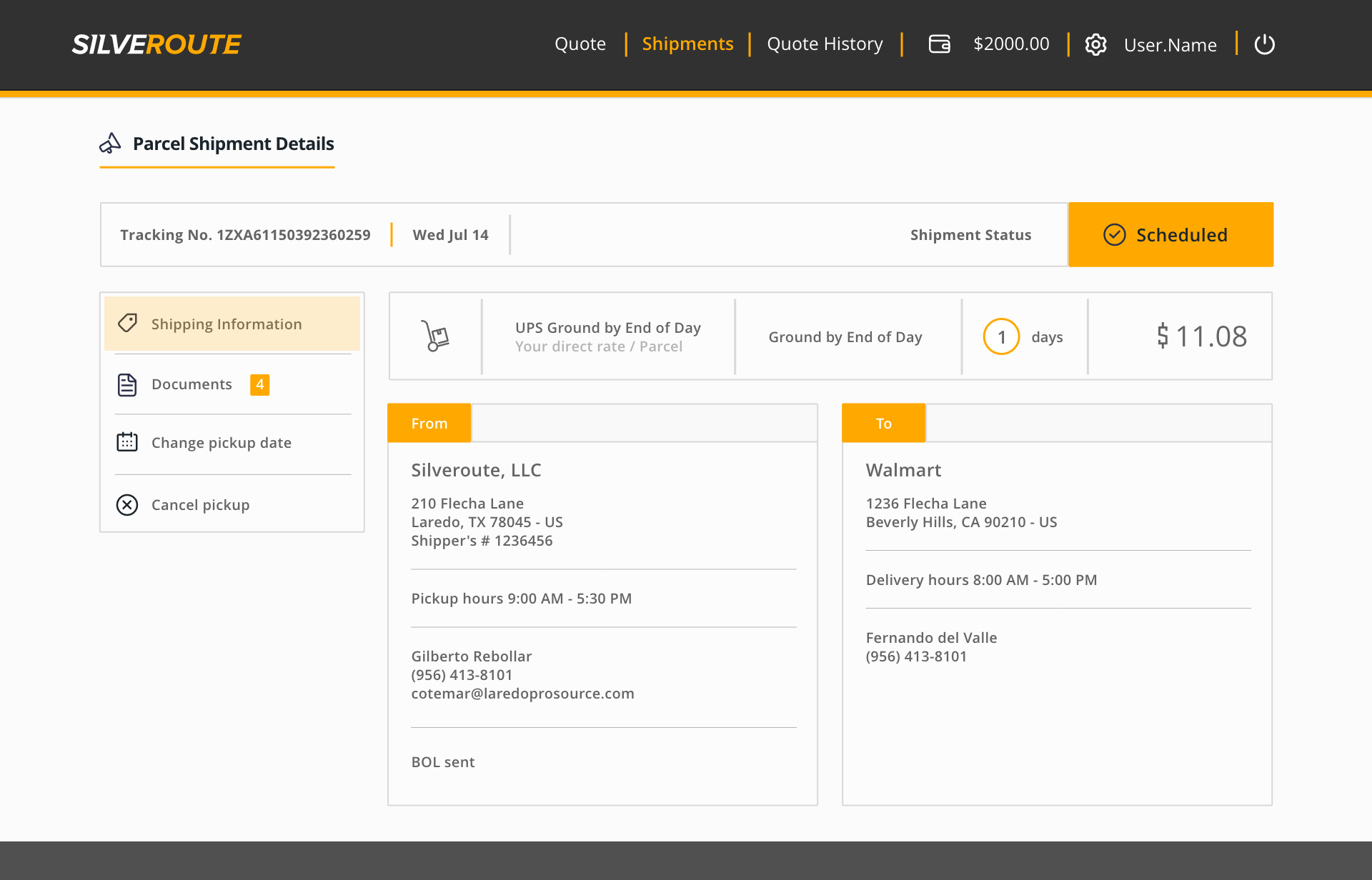
Process Architecture (with API logic & platform flow)

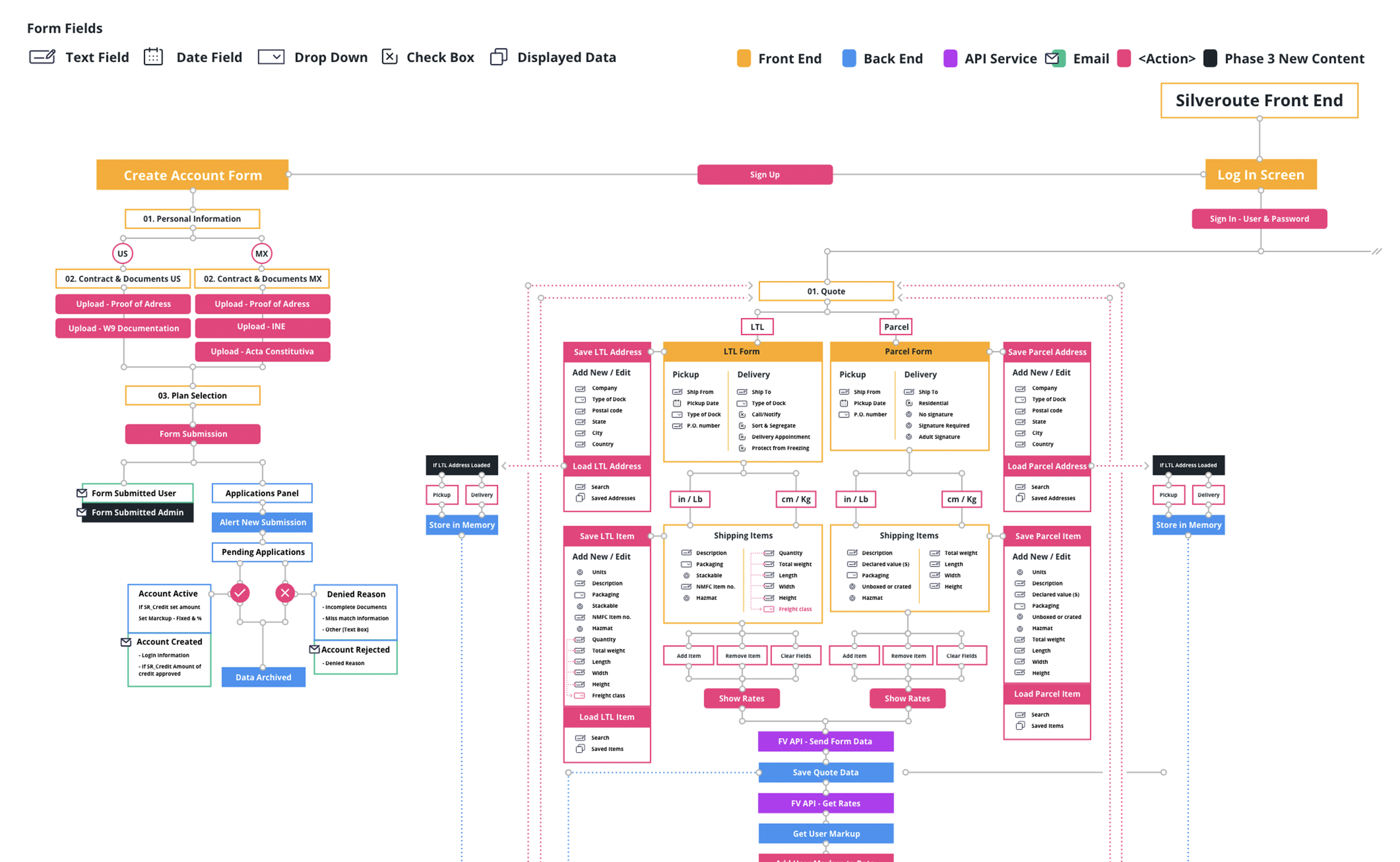
Section Breakdown (PDF) Final UX flow diagram detailing user actions, field types, and API interactions across key modules for the Quote page. Click to view full PDF.
Before designing any screens, I collaborated closely with the client to understand the full scope of their operational goals, technical constraints, and long-term business vision. These conversations helped define a phased rollout strategy, ensuring the platform would be scalable from MVP to future iterations without needing to rebuild core flows.

I began structuring the UX architecture by analyzing the API documentation from our initial carrier integration. The goal was to understand required data fields, quoting endpoints, and expected logic behavior.

- Early diagrams mapped out front-end, back-end, and API responsibilities
-
Field maps defined form types, required inputs, user actions, and conditional flows
-
Slide-in side panels were planned to avoid reloads, maintain screen context, and simplify repeated tasks like saving/loading data

Midway through the project, we made the decision to switch API providers. The first integration presented limitations, including call quotas and sparse documentation. The new provider offered better documentation, improved endpoints, and an overall API structure that aligned more naturally with the client’s goals.

Thanks to our modular UX architecture, adapting the flows was fast and non-disruptive.

These foundational diagrams and system maps helped guide development, align cross-functional teams, and reduce uncertainty throughout implementation.

Quote | Form Module

The quote module became the core interaction hub for the platform — where users would spend the majority of their time. The experience needed to balance detailed input requirements with simplicity and repeat-use speed.

Key Objectives:

  • Allow quoting for both LTL (Less Than Truckload) and Parcel shipments
  • Accommodate repetitive quoting behavior, often for the same destinations/items
  • Support multiple shipments in a single quote session
  • Avoid page reloads or popup disruptions
UX Design Highlights:
  • Split Form Layout: The interface was divided into two core sections — Pickup/Delivery (left) and Shipping Items (right) — to streamline cognitive flow.
  • Slide-In Panels: Instead of popups, users could save/load address and item data through dedicated side panels. These aligned with the form sections (left for addresses, right for items) to maintain orientation.
  • Imperial & Metric Switching: Users could input shipment dimensions in either system. Behind the scenes, values were normalized before being sent to the API.
  • Dynamic Field Visibility: Depending on whether the user selected LTL or Parcel, the form dynamically revealed relevant fields (e.g., NMFC codes for LTL, fewer dimensional inputs for Parcel).
  • Multi-Item Shipment Support: Users could add multiple shipments or items within the same quote, enabling batch processing in a single session.
  • Smart Form Resilience: We avoided adding a 'name' field for saved addresses, since the API only required ZIP codes — this kept the UX lean and avoided unnecessary confusion.
  • Clear Error Handling: Validation guided users through required fields, especially those impacting quote accuracy (e.g., weight, dimensions).
Mobile Considerations:

All components were restructured responsively, with inputs stacked vertically and panels converted into mobile-friendly overlays. Special attention was paid to thumb reach, input clarity, and preserving user context.

Quote | Rate Results

The rate results screen was the critical decision-making moment in the shipment process. Once a quote request was submitted, Silveroute’s platform returned a range of carrier options pulled in from the API. The UI needed to organize this data in a clear, scannable way — especially on mobile — while maintaining access to all relevant rate breakdowns.

Key Objectives:

  • Display a wide variety of returned results without overwhelming the user
  • Make it easy to compare prices and transit times at a glance
  • Allow for deeper inspection of selected rates with cost transparency
UX Design Highlights:
  • Modular Rate Cards: Each quote was represented as a self-contained card showing the most important surface data — carrier name, estimated delivery time, and price.
  • Collapsible/Expandable Sections: Users could click on any card to view a full cost breakdown: fuel surcharges, discounts, accessorial fees, insured value, pickup/delivery terminals, and more.
  • Sorting Tools: Designed around core logistics decision points — 'Cheapest' and 'Fastest' — with one-click toggling between them.
  • Quick Actions: Users could expand/collapse all cards at once or export all rates into a PDF for internal use.
  • Top Bar with Summary + Edit Button: At the top of the screen, users could review their quote inputs (pickup/delivery, date, weight, quantity) and return to the form via an Edit button — all without losing any of their data.
  • Error Management: If rates couldn’t be retrieved from a particular carrier, or if required data was missing (e.g., dimensions for certain parcel services), the system displayed clear warnings below the quote list.
Mobile Considerations:

Each card adapted into a single-column layout with expandable touch-friendly sections. Core data remained visible at all times

Quote | Shipping Form & Label Generation

Once a user selected their desired quote, the system transitioned into the final shipment setup flow. This was where operational information was finalized and label generation was triggered. The form needed to handle detailed business logic while still feeling approachable and easy to complete.

Key Objectives:

  • Provide a structured way to capture operational shipping details
  • Reduce redundant data entry through autofill functionality
  • Give users confidence before label creation and payment
  • Support saved companies for future reuse and speed
  • Keep layout consistent with previous forms to preserve flow
UX Design Highlights:
  • Two-Part Address Forms: Both 'From' and 'To' sections included inputs for company name, address, contact info, delivery window, and purchase order number.
  • Company Lookup with Autofill: Users could begin typing a saved company name, and the system would return matching entries from the database. Once selected, all other fields auto-populated.
  • Delivery Instructions & Checkboxes: Common shipment flags were included (e.g., "Residential Delivery," "Sort and Segregate," "Protect from Freezing") as checkboxes based on carrier API options.re being sent to the API.
  • Preloaded Shipment Items: At the bottom of the page, the system listed the items added during the quote stage — including quantity, dimensions, NMFC codes, weight, and hazmat status.
  • Back Button + Edit Mode: Allowed easy corrections without clearing form state.

Quote | Payment Integration

Shipping quotes confirmed, shipment details locked — now came the final action: payment. The payment flow had to be frictionless, secure, and seamlessly integrated with the platform’s UX structure.

Key Objectives:

  • Support credit card payments with Stripe integration
  • Preserve user confidence through clear summaries and confirmation states
  • Handle failures without disrupting the form flow
UX Design Highlights:
  • Side Panel Activation: Once the user clicked 'Create Shipment & Labels,' a panel opened from the right with all shipment and payment details.
  • Side Panel Activation: Once the user clicked 'Create Shipment & Labels,' a panel opened from the right with all shipment and payment details.
  • Card Selection Dropdown: Integrated Stripe payment component supported selecting the saved card or entering new details.
  • Error Feedback: If the payment failed, the panel closed and an error message (fed from Stripe’s API) appeared in context on the shipment page. The user could retry immediately.
  • Successful Payment Confirmation: Triggered visual confirmation, updated shipment status, and redirected users to the Shipment Details view.

Shipments | Shipment Details + Status Management Tools

After booking, users entered the Shipment Details view — the control center for tracking, reviewing, and managing each shipment. This screen had to communicate status clearly, surface essential data, and support key post-booking actions, all within a single, structured interface.

Key Objectives:

  • Surface all relevant shipment and contact data in one place
  • Clearly display real-time shipment status with actionable visual cues
  • Enable users to reschedule or cancel shipments with guardrails
  • Centralize access to documents and shipment metadata
UX Design Highlights:
  • Status-First Architecture: The top section prioritized shipment visibility with key elements front and center — tracking number, service type, transit estimate, and a dynamic status badge (Scheduled, In Transit, Delivered, On Hold, etc.) with color-coded icons for instant recognition.
  • Modular Side Navigation:The left panel provided intuitive access to all shipment tools:
    - Shipping Info: From/To addresses, PO, contact, and label data
    - Documents: Labels, BOLs, rate summaries, and export forms
    - Change Pickup Date: Date selector and request confirmation flow
    - Cancel Pickup: Streamlined cancelation with eligibility warnings
  • Schedule Management Tools:We integrated two essential operations directly into the UI:
    - Pickup Rescheduling: Users could propose a new pickup date with one click. A lock-out state and confirmation banner prevented repeat submissions or confusion.
    - Cancel Request: A two-step flow ensured users knew what to expect, including cutoff time policies and confirmation feedback from the system.
  • Visual System for Shipment States: From Scheduled to Delivered, each status was paired with a clear color and icon. Error states (like On Hold or Exception) were designed to stand out, guiding users to review or take action.
With this, users now had a reliable command center for managing their shipments post-booking, consolidating everything from shipping documents and contact details to real-time status updates and operational controls. The goal was to reduce support tickets, prevent user errors, and give users confidence that every shipment was under control and easy to manage at any point in its journey.

Settings | Account Settings

The Account Settings section was intentionally kept simple for the first phase of the platform, focusing on essential user needs: password management and payment configuration.

Key Objectives:

  • Provide a clear and secure space for users to manage their login credentials
  • Support two payment methods: Silveroute Credits and a single active credit card
  • Keep the flow minimal, since this is a set-it-once experience for most users
UX Design Highlights:
  • Minimal UI, Maximum Clarity:The layout was reduced to just two settings groups: User Info and Payment Method. Each includes quick access buttons to update either the password or the registered credit card.
  • Single Card Limitation: Silveroute only allowed one card per user in this phase. The interface clearly communicated that updating the card would overwrite the current one, and Stripe’s integration handled secure input and validation.
  • Slide-In Panels for UpdatesEditing the password or payment method opened a focused slide-in panel, reducing page load interruptions and keeping users oriented.
  • Dual Payment Method HandlingUsers could either use Silveroute Credits or a credit card. The UI dynamically displayed the selected method and allowed users to update their choice during onboarding or at checkout.

User Onboarding & Verification

Account creation needed to balance ease of use with a structured verification process. Since Silveroute operates in regulated logistics and handles payment processing, the onboarding flow had to collect documentation while keeping the experience simple and guided.

Key Objectives:

UX Design Highlights:

Outcome + Reflections

The Silveroute platform now runs on a user-centered, API-integrated quoting and shipping system built to serve the real needs of high-frequency logistics teams. While development was handled by engineering, this case study covers the complete product design process — from architecture planning to final UI handoff.

Key Deliverables

  • Flexible quoting tool for both LTL and Parcel shipments
  • Smart forms with dynamic logic, reusable data, and contextual side panels
  • Expandable rate comparison interface for easy decision-making
  • Streamlined payment flows and secure label generation
  • Post-booking shipment management: reschedule, cancel, and document retrieval
  • Integrated shipment tracking with visual status updates
  • Onboarding workflow with document review and billing method selection

Reflections

  • API-driven products benefit from early UX–dev collaboration — aligning on constraints saves rework later
  • Designing for repeat, operational users means every micro-interaction matters: field order, default states, and even scroll behavior
  • In logistics, UX isn’t about delight — it’s about reliability, speed, and reducing user error
  • This was more than just interface work. It was a full system design challenge — structuring flows, planning edge cases, and building an intuitive product from signup to shipment
Thanks for reading!