Makers Website - Telling a Story Through Motion

Designing and Developing a Playful New Website for an Animation Studio

Makers of Media is a UK-based animation studio specializing in eLearning content for clients across education, government, and healthcare sectors. Known for their vibrant visual style and engaging storytelling, the studio needed a new digital home that reflected their evolving brand and showcased their work in a modern, motion-rich way.

I was tasked with redesigning and developing their website from the ground up, defining the user experience, creating responsive layouts, and building the final site in Webflow.
How was I involved?

Product Designer & Webflow Developer

This project was handled end to end, from structure to final build:

- UX Strategy & Site Architecture: Mapped and refined the entire site navigation, flow, and structure through multiple rounds of iteration. Created all wireframes in Figma and aligned the experience to content goals and brand tone
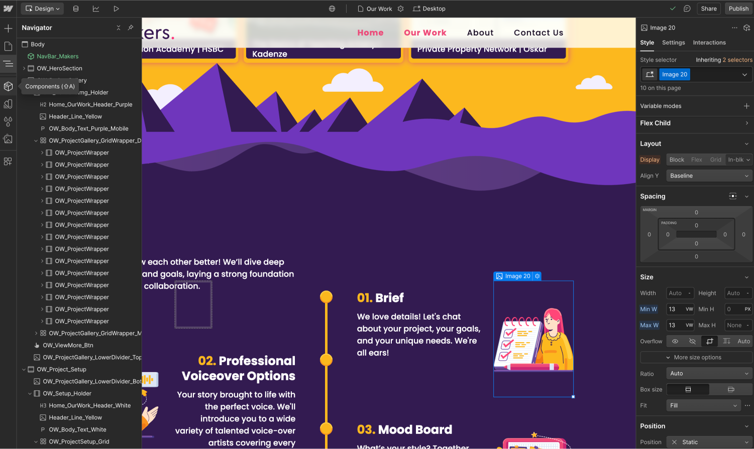
- UI Design & Brand Integration: Designed a responsive, visually rich interface using custom assets and animation. Applied the brand’s color palette, character illustration, and motion principles to create a playful but professional visual rhythm
- Webflow Development: Learned and used Webflow to develop the entire site from scratch, including mobile optimization, class structuring, scroll-based animations, and Lottie integration for lightweight character motion.

______

Client: Makers of Media / www.makersofmedia.com
Illustrations: Jorge Miquilena / @pan_tieso

Overview

Background
Makers of Media’s previous website was dated and no longer reflected the quality or creativity of their animation work. At the same time, the company underwent a full brand refresh — which I led, from redesigning the logo to establishing new brand guidelines, illustration styles, and visual assets.

This gave me a strong foundation when approaching the new website. I understood the brand deeply, which allowed me to translate it into a digital experience that felt both playful and professional.

The founder was used to editing the old WordPress site himself and expected to jump into visual design immediately. I guided the process, introducing a structured UX approach with site mapping, wireframes, and content planning to ensure a scalable, future-friendly solution.
Challenge
One of the key challenges was aligning the studio owner’s expectations with a structured design process. Coming from a self-built WordPress site, he expected to see final designs early, so I had to guide the project through a step-by-step workflow—starting with content planning, navigation mapping, and wireframes before moving into visuals.

Other key challenges included:

- Learning and using Webflow to build the entire site from scratch
- Ensuring a fully responsive layout across desktop and mobile
- Integrating Lottie animations and brand illustrations without compromising performance
- Keeping the experience visually rich but simple to navigate and update

The goal was to deliver a creative, flexible site that felt uniquely tailored to the studio’s personality.

Defining the Architecture

Before diving into visuals, I focused on defining a solid content and navigation structure for the website. Coming from a legacy WordPress site, the studio lacked a clear content hierarchy, and the site had grown bloated over time. I worked closely with the studio owner to map out user goals, page priorities, and content requirements.

Navigation Mapping

We explored multiple versions of the sitemap, initially starting with a large, multi-section layout. After building wireframes based on this first draft, it became clear that the structure was overwhelming — too much information, too many pages, and not enough focus. Using that as a learning moment, I helped streamline the architecture into a tighter, more strategic layout that would be easier to navigate and maintain.
The final structure focused on four core areas:
- Home: A welcoming page with the demo reel, company overview, project highlights, and a contact form
- Our Work: A portfolio section with selected case studies and an explanation of the studio’s animation process
- About: Team bios, studio values, and the mission behind the work
- Contact: Location info and a form to reach out

By defining the architecture upfront, I was able to guide the project through content planning, wireframing, and ultimately into a focused, scalable design system.

Wireframes & Iteration

Once the initial sitemap was approved, I created a complete set of low-fidelity wireframes in Figma to map out the full site experience. These early layouts included every section defined in the original architecture — from detailed service breakdowns to portfolio categories and case study navigation.

But as soon as the wireframes were presented, it became clear that the scope was too large. The structure felt heavy, the amount of content overwhelming, and the experience risked becoming more of a hurdle than a help. This moment became a turning point.

Thanks to the wireframes, we were able to pause and reassess. The exercise helped everyone realize we were trying to say too much at once, which could confuse users and stretch the production timeline unnecessarily.

Together, we scaled back. I revised the sitemap, merged redundant content, and focused on clarity and simplicity. From there, I built a refined set of wireframes that prioritized:.

Key UX goals shaped the wireframes:
  • Structure the site like a story, with visual rhythm and clear content hierarchy
  • Prepare layouts to work smoothly with Webflow’s CMS, making future edits easier for the team
  • Ensure responsive adaptability, with early planning for mobile variations
The shift wasn’t just aesthetic — it was strategic. These wireframes served as a communication tool, helping align the team, reduce noise, and lay the foundation for a more purposeful site.
Refined Wireframes (Final Version) After feedback sessions and simplifying the architecture, I created a streamlined second version. It kept the storytelling spirit and functionality while improving focus, readability, and development speed.

Visual Design & Brand Integration

With the wireframes signed off, I shifted focus to visual design. Since I had previously led the studio’s full rebranding effort, I was already familiar with the tone, illustration style, and visual system that would carry over into the website. This allowed the design phase to move quickly and with confidence, not just aligning with the brand, but fully embodying it.

We leaned into the studio’s playful and vibrant personality, using saturated color blocks, soft-edged section dividers, and plenty of illustration to build a site that feels expressive and approachable. Every scroll felt like moving through a storyboard.

Highlights from the final design system:

  • Color was used to set tone across sections: warm yellows for storytelling, bold purples for clarity and contrast, and pinks for moments of delight
  • Illustrated landscapes and scene transitions divided sections like chapters, helping guide the user naturally down the page
  • All sections were built responsively with careful attention to layout behavior on mobile
  • Core UI components — project cards, team avatars, contact blocks — were structured with flexibility in mind for long-term updates
The Meet the Makers section was a standout. We used illustrated team avatars, previously developed during the brand redesign, and brought them to life using Lottie animation for small but expressive loops. This added motion gave the team a real personality and subtly reinforced the studio’s animation expertise.

To speed up production, I collaborated with our junior designer Jorge Miquilena, who helped create a number of the final illustration assets used across the site. His contributions ensured visual consistency with the brand while also giving us the flexibility to build out additional scenes and icons for the remaining pages.
From page to page, the final site became more than just a portfolio. It became a digital extension of the studio’s creative

Building the Site in Webflow

Although this was my first time using Webflow, I quickly saw its potential. With no restrictive templates and full control over layout and interactions, it became the perfect tool to bring a custom, animation-rich site like this to life.I took a self-taught approach — learning through tutorials, community forums, and documentation — to master key features that aligned with our creative goals:

Key UX goals shaped the wireframes:
  • Responsive Layouts using Flexbox and Grid for fluid designs across devices
  • Relative Units like VW, VH, and REM to fine-tune consistency and scalability
  • Class & Combo Class Systems to keep styling organized and reusable
  • Lottie Animation Integration for smooth, lightweight motion effects triggered by scroll or hover
One of the biggest technical challenges came during mobile optimization. The desktop designs leaned heavily on complex visuals and layered sections — which meant simply stacking content wasn’t enough. I had to rethink spacing, layout order, and content density to maintain storytelling and flow on smaller screens.

By restructuring components and refining spacing through media queries, I ensured the site kept its energy and clarity across all devices. Even Lottie animations were tailored for mobile, so users could enjoy the same playful motion without performance issues.

In the end, the Webflow build didn’t just match the original vision — it expanded it, proving that even a fully custom design could stay maintainable and performant.

Bringing It to Life with Motion

For an animation-focused studio, motion wasn’t just visual polish — it was part of the story. Every animation on the site was crafted to reflect the studio’s creativity and give visitors a sense of playfulness and precision.

All animations were created in After Effects using clean shape layers only, carefully avoiding unsupported elements like effects, expressions, or presets to ensure full compatibility with Lottie. Once complete, each animation was exported as a .json file using Bodymovin, then converted into a .lottie file and uploaded for use inside Webflow.

One key animation was the hero section. To achieve greater flexibility, I exported the animation in separate layers and used Webflow to reassemble them alongside the main illustration. This approach gave me more control over individual elements — allowing precise tweaks to timing, movement, and layering directly within the build, while keeping the animation performant and lightweight.

Motion was applied across the site in intentional ways:

  • Hero Animation was updated to match the new space-themed demo reel, featuring animated characters and floating elements to tie into the studio’s updated identity
  • Animated team avatars added personality and warmth to the “Meet the Makers” section
The end result was a site that not only showcased the studio’s animation expertise, but felt like a product of it — vibrant, responsive, and expressive from the very first scroll.
Thanks for reading!