Crafting Meaningful Logos That Work
This section presents a curated collection of logos I’ve created across different industries.
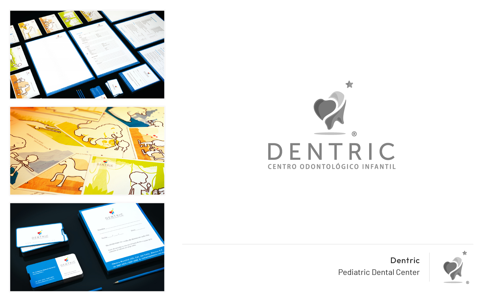
Each identity is shown in context, not just as standalone symbols, but as part of functional, living brand systems.
From printed material to digital assets, the goal has always been to build visual marks that are memorable, flexible, and strategically aligned with each client’s voice.
How was I involved?
Brand Identity Designer
Each of these logos was crafted as part of a broader branding effort, not just as visual marks but as strategic tools designed to communicate a brand’s values, tone, and purpose.
-Research & Discovery: Each project began with a structured intake form to understand the client’s tone, audience, differentiators, and vision. This helped align strategy before design began.
- Concept Development: Explored tailored directions informed by market research and visual references, balancing originality with practical constraints.
- Design & Application: Crafted flexible logo systems that could scale across use cases — from websites and social media to merchandise and stationery. In some cases, I also designed supporting brand materials to extend the identity.
Overview
Background
My foundation as a graphic designer taught me the principles that anchor every strong identity: clarity, balance, usability, and intent. These fundamentals shape every logo I create — from the way a symbol scales, to how it lives within a color system, to how it communicates at a glance.
Over time, collaborating with other designers and creative teams helped refine my understanding of visual balance. I learned how critical proportion, contrast, and spacing are to make a logo not just beautiful, but functional in any size or format. That sensitivity shows up consistently across this portfolio, whether it’s a playful mark for a food brand or a refined identity for a heritage art project.
Challenge
Earlier in my career, I learned the hard way how easily assumptions can derail a project. Without a clear intake process, I’d jump into design thinking I understood what the client wanted, only to realize, sometimes deep into the work, that we weren’t aligned on tone, concept, or message. This often led to unnecessary revisions and delays.
That’s why I now start every branding project with a structured intake form. It helps surface the client’s voice, vision, and expectations right away, so I can build with confidence instead of second-guessing. It also creates space for honest collaboration from day one, which has been a game-changer in the quality and efficiency of the work.