CNDH - Your Rights are Law

TV Spot 01

TV Spot 02

Explaining Human Rights with Clarity and Simplicity

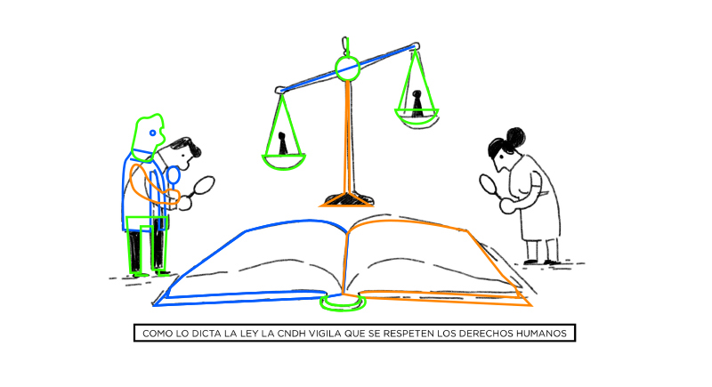
The goal of this project was to produce two short animated TV spots for Mexico’s CNDH (National Human Rights Commission).

The aim was to clearly explain different ways the CNDH works to defend human rights during any legal or state procedures.

The final animations were created using a minimal visual style to make the information feel direct, accessible, and easy to understand for a broad audience.
How was I involved?

- Direction & Art Supervision – Led the project visually, providing direction to ensure illustrations aligned with animation requirements.

-Storyboard & Layer Planning – Translated early sketches into animation-ready assets using layer guides.

- Character Rigging – Prepared characters with light rigs optimized for smooth and expressive motion.

-2D Animation – Animated both spots with a clean, illustrative style that preserved the marker-drawn aesthetic.
______

Client: Mexico's CNDH (National Human Rights Commission)
Contractor: Brabus Films
Illustrations: Carlos Sallas / @carlos_sallas

Overview

Background
I was contracted by Brabus Films (México) to handle the animation for these two explainer spots. To help bring the visual identity to life, I invited my friend and illustrator Carlos Sallas to collaborate on the project.

I felt his clean and expressive drawing style would align perfectly with the minimal, marker-drawn aesthetic the client was after.

As the project lead, I directed the visual development process—guiding Carlos in how to structure the illustrations so they could be easily animated.

Together, we shaped the visual language to reflect the CNDH’s mission in a simple and approachable way.
Challenge
This was one of the first projects where Carlos was creating illustrations specifically for animation. To help bridge the gap, I developed a visual guide for each scene—drawing directly over his sketches using color-coded lines to indicate how characters and elements needed to be layered and separated.

This collaborative approach allowed us to:

- Align on illustration requirements early on.
- Simplify the rigging and animation process.
- Maintain the hand-drawn feel while enabling smooth movement.

Thanks to this process, we were able to ensure the visuals stayed faithful to the original vision while being fully animation-ready.

Sketch Frames


Colour Palette
One of the key visual strategies was using a restrained color palette. The animation was mostly black and white, with color used sparingly as a visual accent. This choice was intentional for several reasons:

- Whiteboard aesthetic: The client wanted a style that resembled hand-drawn explanations on a whiteboard. The limited color palette helped maintain that approachable, educational tone.

- Visual consistency: Limiting color allowed the animations to feel clean and unified, preventing visual overload while supporting the storytelling.

- Accessibility and clarity: With minimal visual noise, the animation remained easy to follow for viewers of all ages and literacy levels, a key goal for CNDH’s communication.
Preparing the Artwork for Animation
As the lead animator and project supervisor, I focused on establishing a production pipeline that would avoid unnecessary revisions and make the most of our tight timeline. Once Carlos delivered the initial storyboards and sketches, I developed a step-by-step visual system to guide the illustration prep:

- Layer Planning: I overlaid each sketch with color-coded guidelines to show how elements should be broken into layers (e.g., heads, arms, legs, props) for independent animation.

- Simplification for Reusability: I suggested ways to keep poses and angles consistent where possible, which reduced the number of redraws and allowed scenes to reuse elements without looking repetitive.

- Rigging Optimization: I advised keeping body parts aligned and separate in straight-on poses where possible, making basic character rigging easier and avoiding complex masking or corrections later.

- Naming Conventions and File Organization: Clear structure and labeling made it easier to stay organized, especially when delivering assets across multiple scenes.This pre-animation groundwork ensured a smooth workflow once we transitioned into production, giving me more time to focus on animation quality and storytelling.


Animation Process
All animation was completed in After Effects, with a large portion of the character and scene movement done using the Puppet Tool.

Since the illustrations were created in Photoshop and retained a hand-drawn texture, converting them into shape layers would have compromised their aesthetic.

The Puppet Tool became the best solution for animating without disrupting the integrity of the illustration style.

Because of the planning done ahead—especially with the careful preparation of layered assets—the characters were able to move naturally and expressively, even with the constraints of raster artwork.

To keep the viewer engaged, we focused on designing organic transitions between scenes. Instead of relying on hard cuts, we found clever ways to connect moments visually, whether through motion paths, morphing shapes, or elements carrying through from one scene to the next.

This helped maintain flow and reinforced the storytelling without distracting from the message.

In addition to character animation, subtle transitions and scene changes were enhanced using other After Effects tools and plugins, always with the goal of preserving the simplicity and clarity of the whiteboard aesthetic.

This process resulted in animation that felt cohesive, approachable, and professional—staying true to the visual tone while keeping the audience visually engaged from start to finish.

Animation

Thanks for watching!
Project Credits — Project Management - Marisol Morin (Brabus Films) + Creative & Art Direction – Rodrigo Serna + Storyboarding & Illustration – Carlos Sallas + Animation & Rigging – Rodrigo Serna