Gaya Laboratories - Brand Redesign

Modernizing Trust in Clinical Diagnostics

Laboratorios Gaya is a family-run diagnostics lab in Puebla, Mexico. The rebrand aimed to modernize its identity while honoring core values like clarity, professionalism, and trust. The goal was to strike a balance: clean and scientific, yet warm and human.

The new system spans from logo to layout, building a visual language rooted in precision and approachability — supporting the lab’s role as both a clinical authority and a caring service provider.
How was I involved?

- Logo Redesign: Rebuilt the visual mark from the ground up, improving scalability, structure, and alignment to brand values
- Visual System: Defined a modular layout grid, color palette, and typography system to maintain consistency across all branded communications
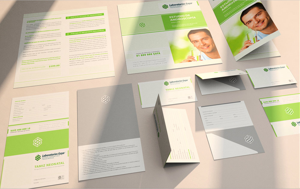
- Print & Collateral Design: Designed all key deliverables including business cards, folders, envelopes, service brochures, and clinical info sheets
- Environmental Graphics: Created iconography and poster design systems for in-clinic use and exterior signage
- Brand Guidelines & Rollout: Provided specifications to ensure visual consistency across departments and vendors
______

Client: Gaya Labs

Overview

Background
The project involved a full-scale rebrand of Laboratorios Gaya, including a new logo, visual system, and comprehensive rollout across brand collateral. As part of the redesign, the identity needed to serve a dual audience: patients seeking approachability and professionals requiring clarity and consistency. It also needed to support complex communication without overwhelming the user.

The new identity system was conceived to feel clean, modular, and scalable. It allows room for photographic content, technical detail, and layout variation — while keeping a consistent tone throughout all brand channels, from brochures to corporate stationery and retail-facing signage.
Challenge
The original logo lacked flexibility for scaling and digital use, and the overall brand lacked coherence across applications. Additionally, the company had grown to a point where internal documents, promotional materials, and service listings required clearer hierarchy, better typesetting, and brand guidelines that could be applied without constant redesign.

To solve this, the brand refresh needed to:

- Redesign the logo with improved geometry, legibility, and symbolic clarity
- Build a layout system that could carry diverse content with editorial logic
- Clarify typographic hierarchy and tone for professional and patient-facing content
- Apply the identity across touchpoints including documents, envelopes, signage, forms, and posters

Logo Redesign

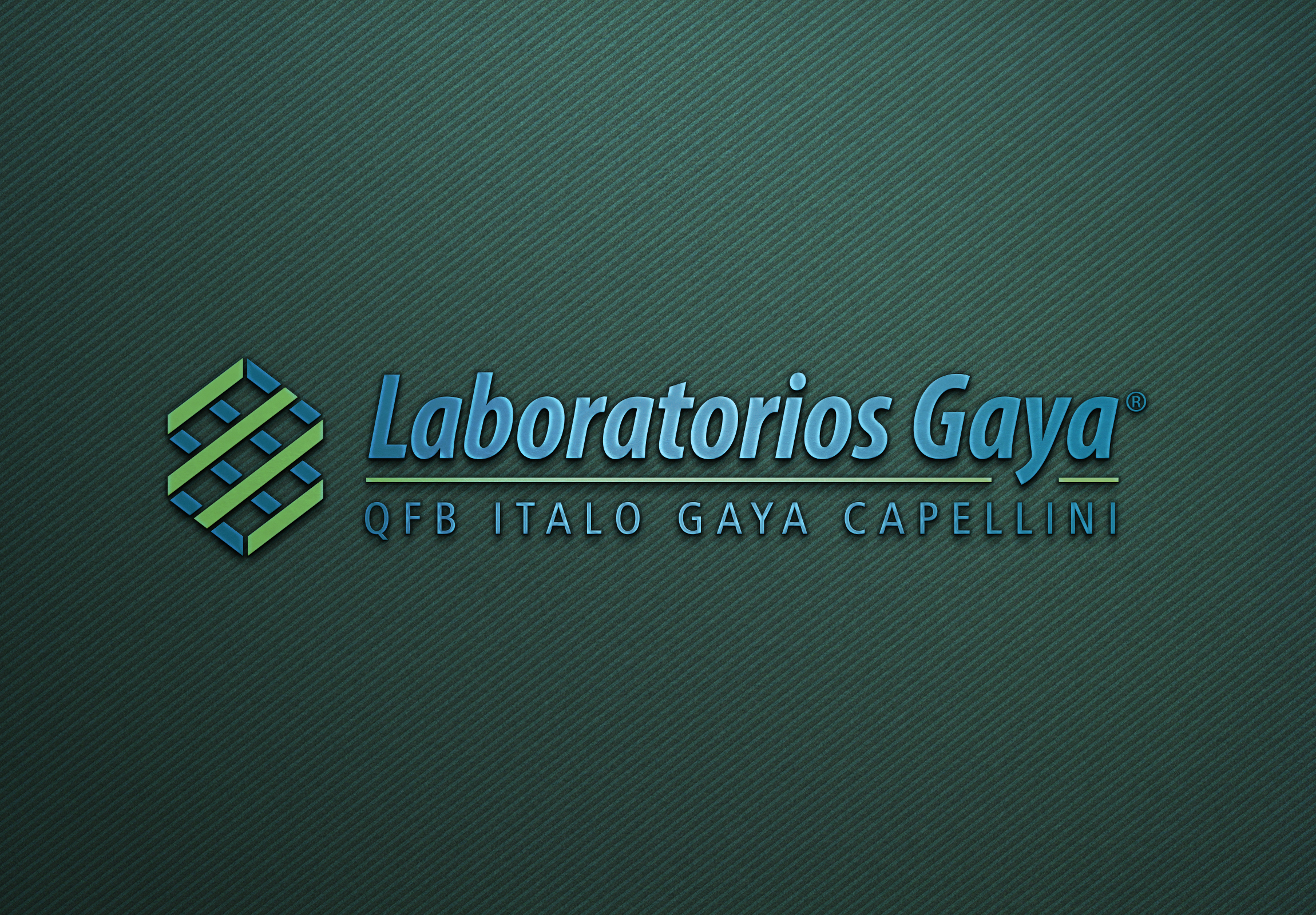
The logo redesign for Laboratorios Gaya aimed to bring structure, credibility, and visual refinement to a brand with deep clinical roots. The original mark, while familiar, lacked scalability and visual coherence across media. The new symbol introduces a geometric motif based on interwoven hexagons, referencing molecular structures and the idea of connectivity in diagnostics. It conveys precision and trust while establishing a stronger, more memorable visual footprint.

Typography plays a foundational role. The logotype is set in Myriad Pro, a humanist sans-serif typeface widely recognized for its clarity and accessibility in medical and scientific settings. By combining both regular and condensed styles, the wordmark adapts seamlessly across different applications — from compact lab reports to bold signage, while preserving a unified voice.

Color also reinforces brand values. A dual-tone palette of deep navy and clinical green signals both professionalism and wellness. Together, these elements form a flexible yet disciplined identity system designed to scale across print, digital, and spatial touchpoints.


Stationery System
The stationery system for Laboratorios Gaya was designed to do more than carry information, it embodied the lab’s identity at every touchpoint. From envelopes to folders, each item balanced clarity and clinical precision with a sense of trust and warmth.

Rather than defaulting to industry-standard formats, we introduced a suite of bespoke pieces:
– Custom die-cut result folders with inner pockets and reinforced seams
– Windowed and full-color envelopes that elevated everyday document handling
– Minimalist business cards with a signature silhouette and practical texture

These weren’t just functional tools. They were tactile brand extensions, carried home by patients, handed over by staff, mailed between institutions, all reinforcing a clear and cohesive message: Gaya stands for professional care with a human face.
A Typographic & Structural System
Consistency across all printed materials was ensured through a robust typographic system based on Myriad Pro. By combining condensed and regular weights, we established clear hierarchies and effortless legibility, even across small medical forms and legal documents.

Color accents helped organize content while reinforcing brand equity. Green was used to guide attention in clinical documents; navy signaled security in items like consent forms or result mailers.

Across the system:

– Clinical forms, patient instructions, and internal guides were simplified for usability
– Carefully spaced fields, dot grids, and clean typographic rhythm improved scan-ability
– Branded folders doubled as practical carriers and brand signifiers

This system wasn’t just well-designed, it was scalable. From day-to-day interactions to institutional communication, every printed piece worked together to set Laboratorios Gaya apart in a crowded sector.

Scaling the Brand: 50+ Touchpoints & Three Years of Growth

The rebrand for Laboratorios Gaya didn’t stop at a new logo or fresh stationery. Over three years of collaboration, the visual identity scaled into an expansive system — one that touched nearly every aspect of the business, inside and out.

From environmental graphics to medical catalogs, every piece was an opportunity to reinforce the brand’s dual promise: scientific credibility with a human approach.
Printed Ecosystem
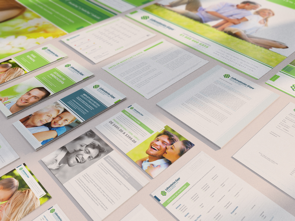
Brochures, result sheets, catalogs, and posters were designed to communicate complex medical information with clarity and warmth. These materials followed a unified visual logic, modular layouts, photographic accents, and a consistent typographic rhythm, making them feel both credible and approachable.

Key deliverables included:

- Patient education brochures for specific studies and services
- Instructional forms and consent sheets
- Clinical catalogs with comprehensive service listings
- Promotional flyers and posters for campaigns and in-clinic communication
Signage & Environmental Design
Beyond paper, the brand lived in the space itself. Signage systems for navigation and compliance were built using custom iconography and a unified visual tone, turning functional signage into brand carriers. Waiting rooms, hallways, and service areas reinforced the brand’s presence and professionalism.

- Interior signage sets with custom pictograms
- Wall-mounted informational displays and campaign posters
- Directional systems designed for clarity in clinical environments
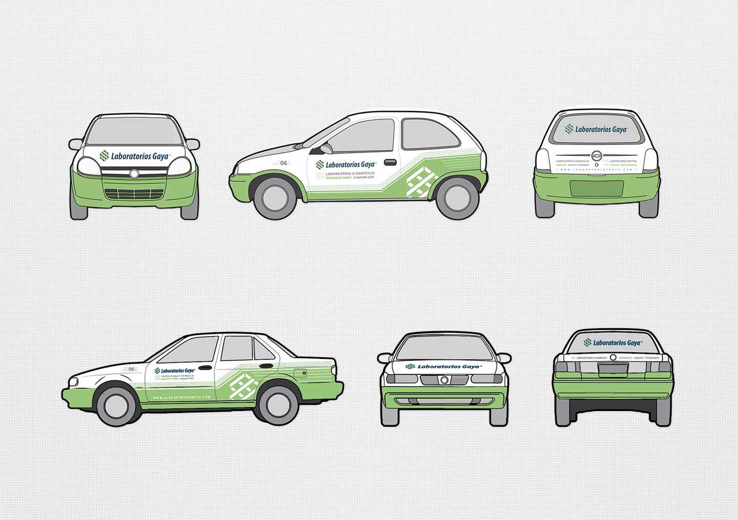
Mobile Branding & Vehicle Wraps
The Gaya identity extended into the streets of Puebla through a fleet of branded service vehicles. Designed to stand out with minimal graphics and high visibility, the wraps brought consistency and recognizability to the brand’s mobile presence, while reinforcing their 24-hour lab-at-home offering.
Thanks for watching!