Cafe Loisl - Branding

Viennese Coffee Tradition with a Modern Identity

Café Loisl is a Viennese-style coffeehouse located in the heart of Hong Kong. This branding project was all about balancing classical charm with a refined, contemporary aesthetic that would resonate with a global urban audience.

The visual identity was inspired by the detailed elegance of traditional European cafés, combined with design choices that speak to modern sensibilities. From crest redesign to branded packaging, each piece was developed to evoke quality, storytelling and a sense of cultural heritage.
How was I involved?

- Logo Redesign: Modernized the original crest for better versatility while preserving its heritage look and feel.
- Visual Identity System: Developed the full branding system including color palette, typography, layout styles, and brand guidelines.
Packaging & Print Design: Created branded collateral such as menus, bookmarks, business cards, and takeaway materials using custom finishes.
- Mockups & Art Direction: Designed and rendered mockups to visualize how the identity would translate across physical and retail applications.
______

Client:Cafe Loisl

Overview

Background
I was commissioned to fully develop a new brand identity for Café Loisl. The client wanted to retain the traditional European roots of the café while also presenting a clean and cohesive look that could scale, from interior details to printed goods and retail packaging.

A key aspect of the brief was to create a consistent experience that extended beyond just the logo, unifying all printed, spatial and product elements under one elegant, easily recognizable visual system.
Challenge
The original crest design lacked adaptability across different uses and formats, especially digital and small-scale print. Additionally, the brand needed a system that could accommodate illustration, storytelling, and product packaging without losing visual consistency.

To solve this, I:

- Redesigned the crest for clarity, versatility and modern reproduction
- Developed a flexible design system including color, layout, and print finishes
- Created a packaging and merchandise system that felt cohesive and premium
- Collaborated with a local artist in Hong Kong who illustrated a series of Viennese coffee personas to bring the brand’s narrative and products to life

Crest Redesign

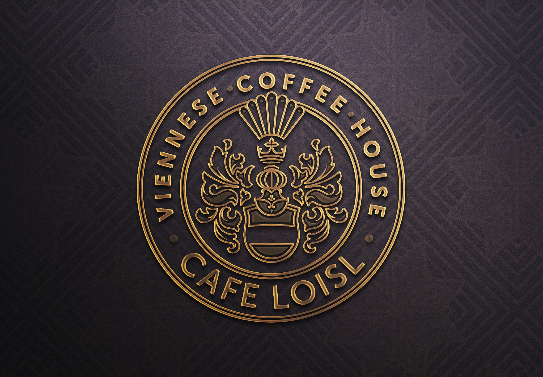
The visual identity of Café Loisl centers around a modern reinterpretation of the Loisl family coat of arms. Originally adorned with intricate baroque detailing and rich ornamentation, the historic crest was refined to suit contemporary branding needs while preserving its noble essence.

Key elements, including the crowned helm, feathered plume, and scrolling mantling, were carefully preserved, but redrawn with simplified lines and a symmetrical structure. The updated version introduces geometric balance through a custom grid, improving clarity and ensuring consistency across print and digital formats.

The final mark is both functional and ceremonial: elegant enough to emboss on leather-bound menus or foiled onto business cards, yet adaptable for small-scale reproduction on coffee cups and packaging. It serves as a bridge between legacy and modernity, lending authenticity and distinction to the brand.


A System Rooted in Heritage
The Café Loisl visual identity is designed to echo the opulence and structure of a traditional Viennese coffeehouse while translating seamlessly into a modern brand experience. The color palette, led by deep burgundy, roast brown, ivory, and muted gold, draws from the materials and ambiance of Old World interiors: velvet banquettes, polished woods, and gilded accents.

Typography plays a central role in reinforcing this atmosphere. The combination of Museo Slab and Museo Sans creates a rich interplay between tradition and modernity. Museo Slab, with its structured serifs and geometric rhythm, provides a foundation of sophistication that feels carved and architectural — a subtle nod to neoclassical signage. Museo Sans, its softer, cleaner counterpart, provides clarity and balance, ensuring legibility across sizes and media without sacrificing personality.

Business cards, coasters, and takeaway collateral carry these values through layered production techniques:

– Letterpress and blind embossing for texture
– Gold foil stamping to signal elegance
– Uncoated, textured paper stock for tactile warmth

Each item functions as a miniature brand ambassador, delivering not just contact information or functional utility, but also mood and memory.

Decorative borders, symmetrical layouts, and ornamental separators evoke Art Deco influences — particularly visible in the framing details and iconography throughout the print system.
Menus & Illustrated Collectibles
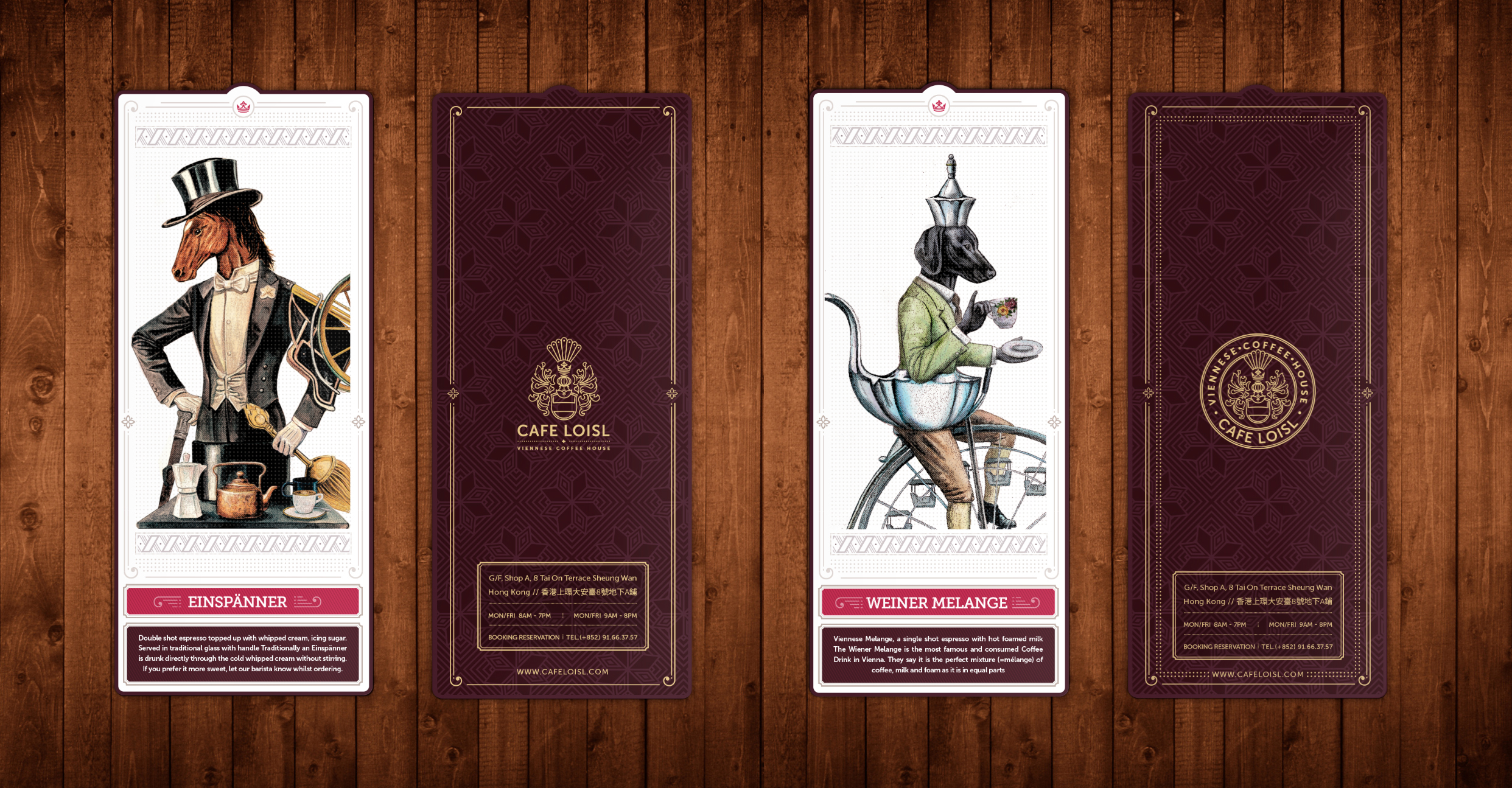
The printed menus are structured as both utilitarian tools and decorative objects. Covers are fabricated in a tactile, soft-touch stock with a diamond debossed pattern, referencing the quilted textures found in Viennese interiors. Inside, the layout hierarchy is carefully calibrated, bold headers using Museo Slab define categories, while slim lines, subtle color bars, and dotted rule guides create separation and rhythm.

Each section is color-coded, helping guests navigate the menu while reinforcing the visual system: warm reds for espresso drinks, deep olives for teas, and plum tones for desserts. Item names are set in high-contrast slab type, with descriptions in Museo Sans, ensuring typographic clarity without sacrificing character.

The illustrated bookmarks serve as narrative extensions of the brand. Each features a surreal yet regal character rendered in watercolour — from an anthropomorphic hound perched in a teacup-bicycle to a baroque opera singer blooming from fine china. These are not only playful design pieces but also collectible moments of storytelling, folded discreetly into the dining experience.

The reverse side includes drinks descriptions, café details, and subtle patterns that match the overall brand language.
Brand Extensions & Material Expression

The Café Loisl identity finds its fullest expression in the physical world,  not just through logos and color palettes, but through textures, patterns, and production details that enhance every touchpoint of the guest experience.
Packaging & Takeaway
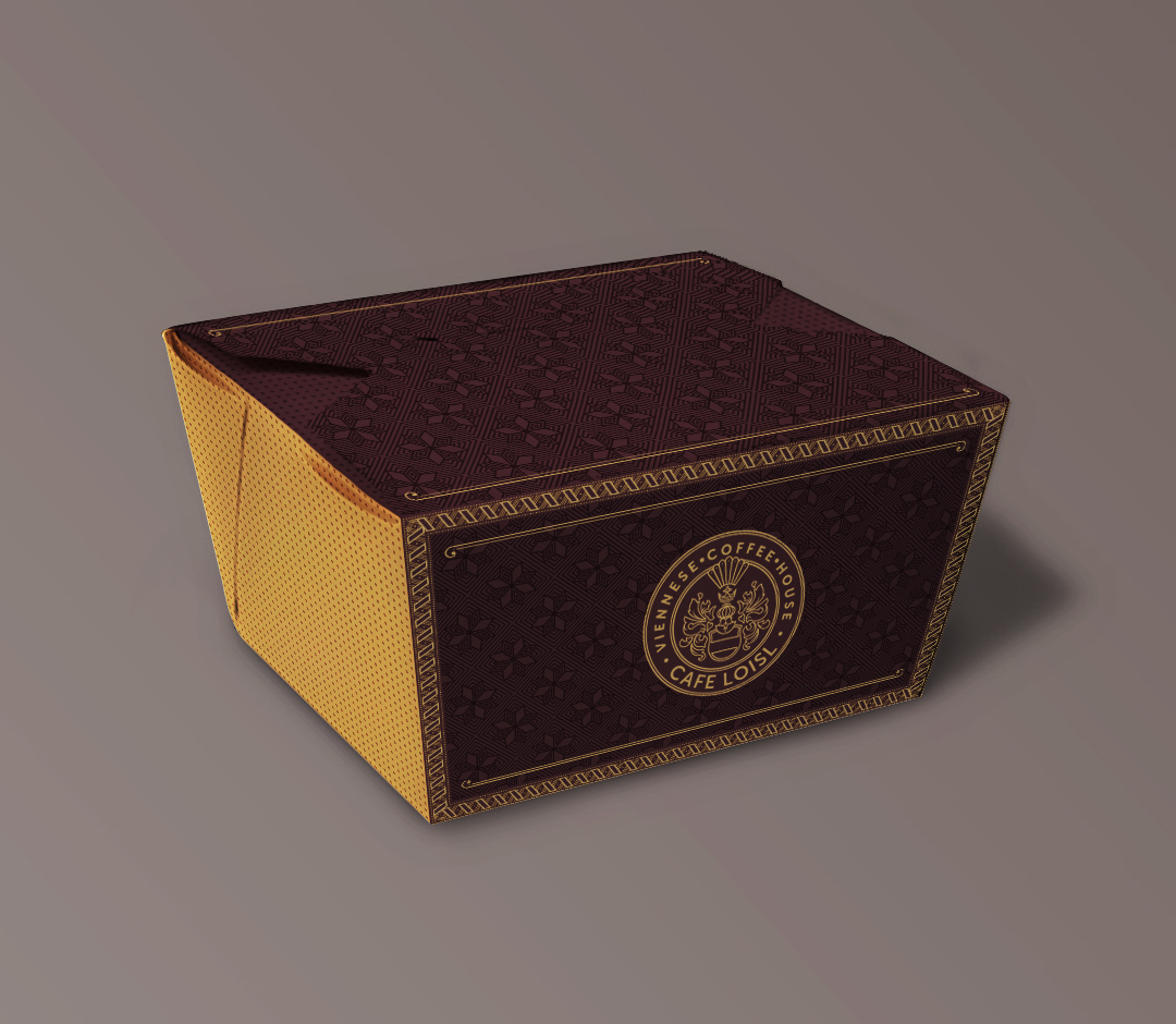
From takeaway packaging to dine-in accessories, the brand maintains a consistent tone of refinement and heritage. Coffee bags are produced using matte, textured stock, featuring a large, gold-foiled crest and subtle geometric overlays. The layout is anchored by a deep burgundy label that introduces product names with typographic hierarchy and old-world charm. This combination of ornamental detailing and clean, spacious layout evokes the balance between craft and clarity.

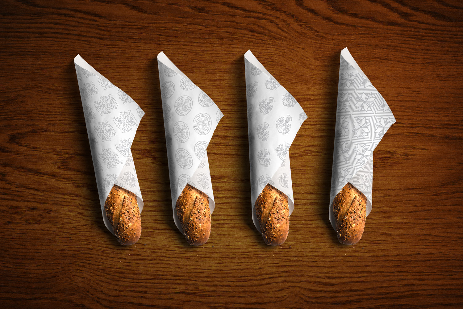
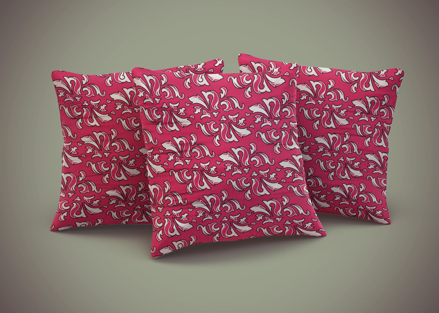
Croissant wraps and food liners showcase a family of brand patterns, including icon arrangements of the crest, radial flourishes derived from the crown motif, and custom tessellations. Printed in soft gray tones on uncoated stock, they bring elegance to utilitarian items while maintaining a restrained, artisanal character. These surfaces act as moving extensions of the café’s visual language, turning simple acts like unwrapping a pastry into moments of brand interaction.

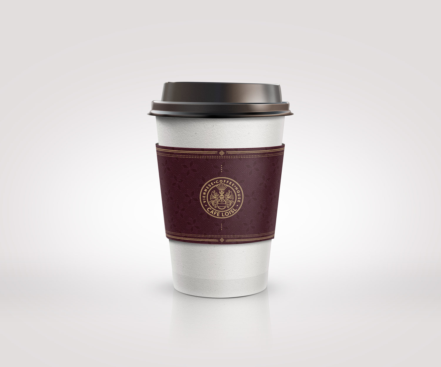
Branded paper cups follow the same visual discipline: warm-toned sleeves in rich burgundy feature the round crest in gold, framed by layered border treatments and micro-detailing that nods to Viennese print tradition. Even at smaller scales, the brand system remains legible, composed and visually distinctive.
Thanks for watching!